Get Ready for the European Accessibility Act
Contrasts - Your tool for color contrast checking and WCAG-compliant accessibility. Improve your digital world now.
Lightning-fast & Intuitive: Color Recognition
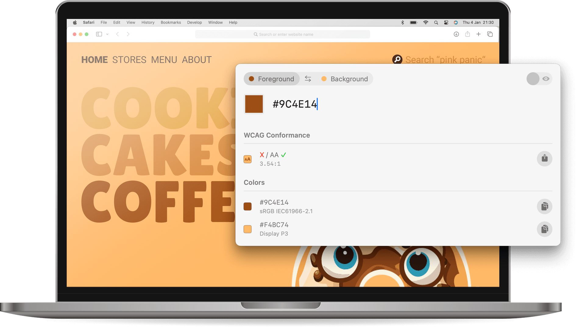
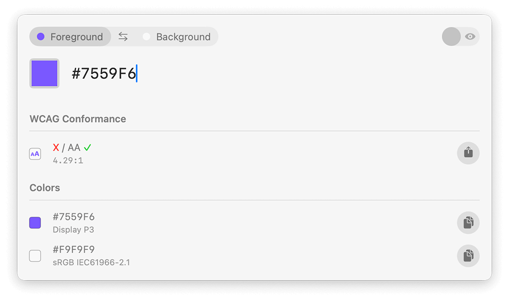
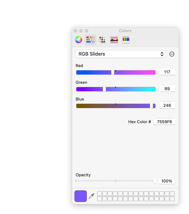
Contrasts makes color selection easy – whether it's from your CSS using HEX or RGB values, from the code of your iOS or Android app, or simply via the color picker. Our intelligent text field automatically recognizes inputted colors, saving you from cumbersome conversions, and supports various color spaces like sRGB, Display P3, and more. Quick, straightforward, and perfect.
Why to choose Contrasts over websites or other apps
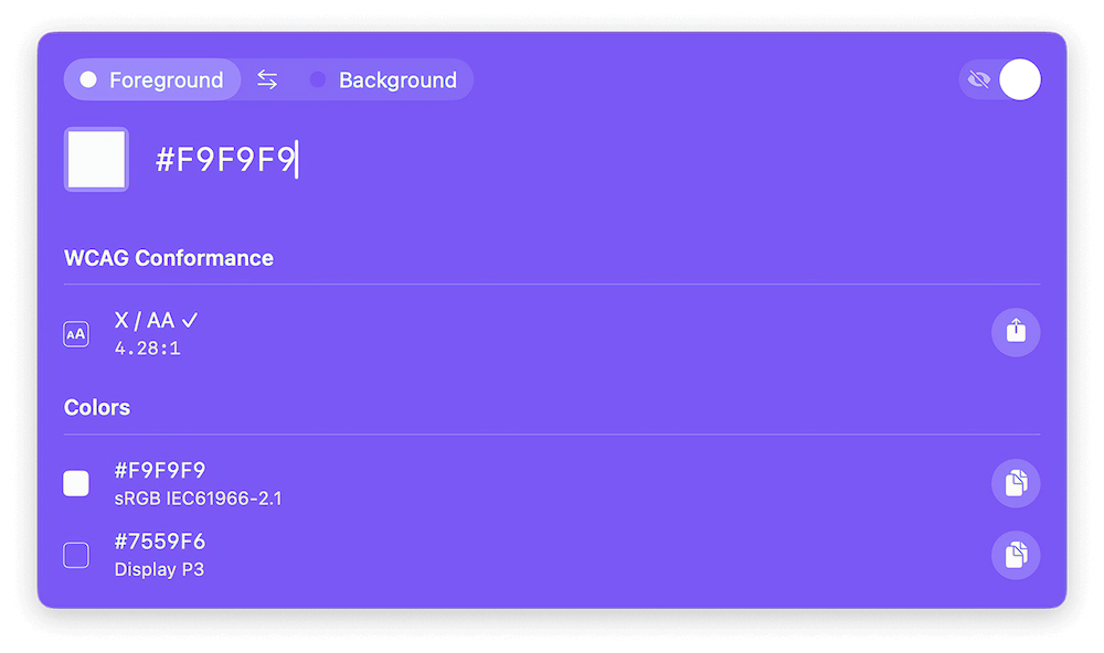
WCAG conformance
Contrast rating is based on WCAG 2.1 success criteria ensuring adherence to accessibility standards.
Code to color
No need for translating colors to HEX first since our smart textfield accepts almost any color representation.
Shortcuts
Contrasts can be opened from everywhere at any time as popover window the same way you use Spotlight.
Color Spaces
Supporting different color spaces that are displayed along with colors to avoid confusion and calculation mistakes.
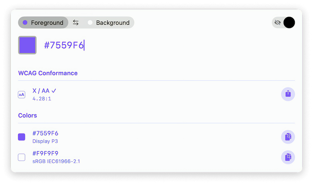
Preview Mode
When activated, the whole UI is colored with your selection which also makes finding high contrast color pairs super easy.
Export & Share
Your colors and results can be exported in various formats and shared with your collegues and friend with on click.
Bring your Colors to Life: Preview Mode
Elevate your design process to new heights with our revolutionary Preview Mode. Experience the vibrancy of your chosen colors as they spring to life on our intuitive user interface. Seamlessly switch between hues using our convenient feature, guaranteeing your design achieves impeccable contrast and readability. Unlock the potential of our Color Contrast Checker to effortlessly enhance your creations.
Contrasts Plus Subscriptions
What our client say about us
European Accessibility Act
At the moment, I am working on compliance with the upcoming European Accessibility Act in our company and have looked at various web/app-based solutions. Contrasts is by far the best solution because it can be opened quickly and at any time and I don't have to convert the web developer's colors into gb values. Really great solution!

Juli375
Apple App Store
Awesome for previewing / converting colors (web, code)
Until now, I've used various websites to check color contrasts. However, it's sometimes super cumbersome, and when our developers send me colors (iOS or RGB), I usually have to convert them first :/ What's cool about Contrasts is that I can now skip both steps. Using a shortcut (similar to Spotlight), a search bar opens, automatically understanding color values or programming code. And it displays WCAG compliance correctly. Really great idea!
RigiWinter
Apple App Store
Contrasts: Elevating Web Design Accessibility to New Heights in Compliance with the European Accessibility Act
Contrasts is more than just a tool for adjusting contrast; it's a key asset for web designers navigating the complex landscape of accessibility compliance, especially concerning the European Accessibility Act. Its user-friendly interface, EAA-specific features, real-time analysis, compatibility, reporting capabilities, and productivity enhancements make it an essential companion for creating web homepages that are not only visually appealing but also inclusive and compliant with European accessibility standards. I highly recommend Contrasts to fellow designers seeking a reliable solution for meeting the requirements of the European Accessibility Act.
Gunzmann
Apple App Store
Want to ask something from us?
What is the European Accessibility Act, and why is it important for businesses?
The European Accessibility Act is a directive aimed at making products and services more accessible to people with disabilities across the EU. It sets standards for digital accessibility, including color contrast, to ensure that everyone, regardless of ability, can access and use digital platforms. Compliance with this act is crucial for businesses to avoid legal ramifications and to foster inclusivity.
How does color contrast relate to the European Accessibility Act?
Color contrast is a key component of digital accessibility mandated by the European Accessibility Act. It ensures that text and important visual elements are distinguishable to users with visual impairments or color vision deficiencies. By conforming to color contrast guidelines outlined in the act, businesses contribute to creating a more inclusive online environment for all users.
Why should companies prioritize checking color contrasts on their digital platforms?
Checking color contrasts is essential for ensuring that digital content is accessible to all users, including those with visual impairments. Non-compliance not only violates accessibility regulations but also excludes a significant portion of the population from accessing information and services online. Prioritizing color contrast checks demonstrates a commitment to inclusivity and legal compliance.
How does your app assist companies in conforming to the European Accessibility Act?
Our app provides a user-friendly interface for checking color contrasts on digital platforms. By simply inputting colors and text, users can instantly determine whether their designs meet WCAG (Web Content Accessibility Guidelines) standards mandated by the European Accessibility Act. This tool empowers businesses to identify and rectify accessibility barriers, ensuring compliance with the law.
Is compliance with the European Accessibility Act a legal requirement for all businesses?
Yes, compliance with the European Accessibility Act is a legal requirement for businesses operating within the EU. The act mandates accessibility standards for various sectors, including digital platforms, to ensure equal access to goods and services for people with disabilities. Non-compliance can result in legal penalties and reputational damage. Therefore, it's imperative for businesses to prioritize accessibility initiatives, such as checking color contrasts, to meet legal obligations and promote inclusivity.